The Spoon

Featured


12499378_10153330016656824_1456724458_o

Spoon

The tea spoon I was given to this assignment was an ordinary metal tea spoon, by applying the SCAMPER I substitute the materials for renewable primary products, 100% compostable and environmentally friendly, modifying the spoon by rearranging its anatomy, eliminating the stem and making a steady handle from tip to drop

This is an aesthetic and eco-friendly alternative to the ordinary single-serving plastic crockery.

The spoon will display a natural design, which will be perfect for food presentations, events, catering and barbecues.


These wooden spoons are tasteless and food-safe, allowing us to put them to use and combining them with other products


We are focusing our marketing strategy in combining with a high quality rice packaged on recycled kraft paper, the innovating design of the bag of Rice will be adaptable to bring the complementary wooden spoon as a perfect duo


LA- Put Thought Into Your Design

Design a 5-page website or blog to promote your hometown (or any other place if you so choose). Present your design along with a strategy that explains the decisions you’ve made during the design process (keep the six steps mentioned in the lesson Web Design Process: Designing for Web (part 2) in mind). Remember, it’s important for us to see how you think, so explain why you decided to do things the way you did.

This is a front-end design learning activity. No coding or publishing is needed.

Please upload this activity to your WordPress blog along with a Word document or PDF explaining your strategy.


learning activity tourist page-01


learning activity tourist page-04


learning activity tourist page-05


learning activity tourist page-02


learning activity tourist page-03

Learning Activity – Design Different Looks

Copy the exact content from a homepage of a website of your choice. Now redesign this homepage in three different ways. Each design should evoke a different emotional response from viewers. You can choose what you would like these emotional responses to be.


I choose Mercadona, which is a super simple and boring page

web altern-01

I wanted to keep the elements and colours from the original page and yet make it more inviting and warm.

web altern-03

On my next I used a full screen picture and I wanted to do something cooler, I was bored by the navigation and generic Icons, so I create a dropdown menu floating on a rack full of fruits, I tried to evoke variety and easy navigation.


web altern-04

A totally different approach, walking away from the boring colours from the original page, and gathering some of the tabs by category, I present the new mercadona, fresh and friendly

web altern-02

LA- Get the Basics Right

welcome-to-the-internet1

1. Explain the following terms in your own words:

The Internet

The Internet is a global network connecting millions of computers. More than 190 countries are linked into exchanges of data, news and opinions.

Internet users represents nearly 40 percent of the world’s population.

HTML

HTML stands for HyperText Markup Language. Developed by scientist Tim Berners-Lee in 1990, HTML is the “hidden” code that helps us communicate with others on the World Wide Web (WWW).

Search engine

Search engines are programs that search documents for specified keywords and returns a list of the documents where the keywords were found. A search engine is really a general class of programs, however, the term is often used to specifically describe systems like Google, Bing and Yahoo! Search that enable users to search for documents on the World Wide Web.


Browser

 A browser is software that is used to access the internet. A browser lets you visit websites and do activities within them like login, view multimedia, link from one site to another, visit one page from another, print, send and receive email, among many other activities.
The most common browser software titles on the market are: Microsoft Internet Explorer, Google’s Chrome, Mozilla Firefox, Apple’s Safari, and Opera.
 2. Please research and add another 10 questions to the briefing process.(See the
lesson.)
 
10 from school

What kind of visitors are you expecting on your website? (Consider their income, interests, gender and age.)

Who are your competitors and how do you differ from them?

What actions do you want visitors to take on the site?

What is your deadline for completing the site? How big is the budget?   

What features should be used on your website? (This includes things like contact forms, pictures, videos, etc.)

Please list the names of three sites that you like and explain what you like about them.

Do you have any colour preferences? What should the look and feel for the website be?

Who will be the contact person for this project?

What do you NOT want on your site in terms of text, content, colour and graphic elements?

Who will be responsible for maintaining the website? Will the person have the time and skills to do so?  

Will you be offering advertising on the site?

How much do you have to spend?


Mine 10

How many sections will it have & what are they?

Do you have a domain name

Will you be needing hosting

Will you be needing e-mail facility

Will the page include any artwork – photography, illustrations, animation, video

Special requirements – multiple languages, accessibility, specific technologies

What tone or image do you need to portray?

What is your ultimate goal and how will you measure it?

What previous design and marketing materials have you used?

Will the page have a search option

Final 10

What is your ultimate goal and how will you measure it?


What previous design and marketing materials have you used?

Do you have any colour preferences? What should the look and feel for the website be?

Will the page include any artwork – photography, illustrations, animation, video

What kind of visitors are you expecting on your website? (Consider their income, interests, gender and age.)

Who are your competitors and how do you differ from them?
What is your deadline for completing the site? How big is the budget?   
Do you have a domain name?
Special requirements – multiple languages, accessibility, specific technologies
Who will be the contact person for this project?
Part two
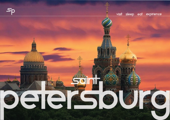
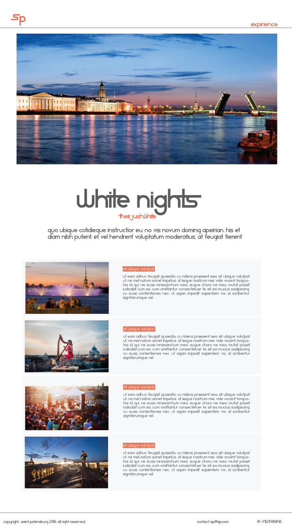
Surf the web and find 10 sites you would consider to be great websites. Simultaneously, make a list of 10 sites you consider bad web sites. Remember to describe why you would define them as such. Upload your lists on your blog.
Cool ones
www.twofold.com Cool design, great surfing experience
http://epipheo.com Straight forward, love the vids
www.stussy.co.uk Clean, cool to shop
http://lubezki.indio.com.mx Interactive and cool
http://pro.boombotix.com/ cool intro, cool transitions
Ugly ones
www.bt.no  messy, horrible way to display information
http://www.ba.no messy, horrible way to display information
http://www.vg.no messy, horrible way to display information
http://www.lingscars.com/ All over the place

Learning Activity – Pace and Contrast

Compare the design (in terms of pace and contrast) of an online magazine, blog or website to that of a printed magazine, book or journal.

  1. What differences can you see between the kinds of design strategies used in the two formats?
  2. Write down your findings and upload it to Moodle.


I chose Bergens Avisen (BA) as my example.

They use the same kind of headline, with the letters of the newspaper and the marketed red colored background. This is to keep them simular.

A difference between them both is that the online version gives you a lot of commercials comparing to the printed version. They have commercial all over the page.

And when it comes to layout, it seems like they play abit more with the pictures and layout in the printed version, rather than on the online version it is more on a row downwards to keep it easy for mobile and tablet users as well.

The text is much tighter and in columns in the printed version, while it is only one long column in the online version. It is adapted for the mobile user-friendliness.


Learning activity – Form and space

  • Rearrange shapes cut out of paper, and try to find the point at which the figure disappears into the ground.
    • Cut out a series of shapes from black paper – squares, rectangles, circles and random shapes – in a variety of sizes, from small to large.
    • Working with a square piece of white paper, place shapes of different sizes into the white space; place them on the white one at a time and move them around.
    • Try to find the point where the distinction between figure and ground becomes unclear. Does it depend on which shape dominates the space: black or white? Is it about the position of the shape within the space? Think about how important figure-ground relationships are within composition and design.


After reading my task, I did exactly what was asked. I cut out some shapes trying to figure out how to make them play with the ground.

So I started with squares and rectangles and soon I put them all one by one and it reminded me of a night city which u can see below

12443421_1373130782710060_778036497_o

Then I turned another way around and I found out it still was a city, u wanna try that?

12443421_1373130782710060_778036497_o.jpg

So I was thinking of b&w illusions and I made this.

12476797_1373130796043392_1553606025_o

Are the stairs black or white?

I found that u just have to look from another angle, and shapes and space will be different like here

12325489_1374237002599438_1602423434_o.jpg

It’s fun to see it as 2 twins faces or as a white vase.

And at the end I thought about one pic that have seen before so I remade it with paper. U remember the guys.

12380974_1373130736043398_506291607_o

LA – Design of Layout in InDesign

I was a bit lazy for this one but, here it goes anyways:


Using InDesign, design a 4-page brochure for a fictitious travel agent.

  1. The size of the brochure should be A5 (when it is folded).
  2. Design the brochure in full colour.
  3. Use fake body copy, but create sensible headings.
  4. Use titles, headings and images of your choice.
  5. Be sure to pay attention to:
    • Choice of type
    • Choice of imagery
    • Use of layout and grid to communicate the content.

Inca Trail

LA – Basic Principles of Layout

Take a magazine, newspaper or book that includes images and text. Lay tracing paper over the top of three spreads (both left-hand and right-hand pages). Using a pencil and ruler, carefully trace the grid underlying the page layouts. Remember to remove specific text elements or images, and to only draw the grid lines. Note column widths and margin sizes at the top, bottom, and to the left and right of the main body of text. Is your document based on a two-column, three-column, or another type of grid? Which elements stay the same on each page, and which change?

Publish your findings to your WordPress blog and provide photos or scans of your exercise.


For this assignment I worked with Januarys Playboy’s.

12516841_10153481012471824_24508045_o


12887316_10153481001996824_1143406771_o12596600_10153481001706824_142316931_o12443653_10153481012281824_1909876453_o

Column wide on page 1: Column 1: 6 cm  Column 2: 6 cm  Column 3: 6 cm
Column wide on page 2: Column 1: 6 cm  Column 2: 6 cm  Column 3: 6 cm
Top border: 1 cm
Bottum border: 1 cm
Inside margin border page 1: 0,5 cm
Outside margin border page 1: 1 cm
Inside margin border page 2: 0,5 cm
Outside margin border page 2: 1 cm