Learning Activity -Understanding positioning

Look at the following logos and explain in your own words what you consider their positioning to be


Coca Cola                                                                                                                                    

Or coke as we call it is the boss of sodas.Like if I’m gonna drink soda is a given a coke would be the choice. Sometimes I might fancy some funky flavours and feeling adventurous spending a night with a fanta, or keeping it light with a sprite, but I always will go back to the boss.

Coke keeps it real and stay true to its promises to refresh the world. 

Coke is an instant synonym of freshness and is drunk every-freaking-where, so yeah refreshing the world, keeping it personal and close to people with campaigns like; “Share a coke” and those annoying cans and bottles with peoples names on. I hated that one; I never found a Daniel-one so I ended up drinking soda with the name of Ole or Atle. Coke is everywhere and wherever they are they are the top dog. Sports, music, multimillion TV ads. Whatever Coke does, they do good. That might be the reason why nobody is ordering rum&pepsi.

Das Auto                                                                                                            

Volkswagen, meaning “People’s car” in German, is among the biggest if not the biggest car manufacturer in tze world. The word on the street is that it started in the 1930s, at the request of Hitler to produce a car designed by Ferdinand Porsche. Da Führer was looking for someone who could make a cheap car that the common German worker could afford.

Volkswagen to me inspires german precision for an affordable price, they have deliver iconic cars like the Beetle and Golf (had them both). The Golf, Beetle and Passat are on some kind of list where Volkswagen has the most record of records of how many cars have been ever sold and some other really smart stuff i found in wikipedia https://en.wikipedia.org/wiki/Volkswagen

  Visa, Everyone, Everywhere, Ever Very                                                                                 

There are some things money can’t buy. For everything else there’s Mastercard.

When it comes to credit cards that’s been the slogan that always caught my attention, but on my everyday I see visa like the  best way to pay and be paid and I know that with VISA I’m accepted everywhere.

Visa connects consumers, businesses, financial institutions, and governments everywhere, secure and reliable Visa is not a bank and does not issue cards, extend credit or set rates and fees for consumers.

However Visa enable its financial institution customers to offer consumers more choices: pay now with debit, ahead of time with prepaid or later with credit products.”

Visa – It’s Everywhere You Want To Be.

Lets work backwards! Look at the logo on the Apple iPhone and, by doing your own research, investigate the history of the product and the company that manufactures it. Give an outline, in your own words, of what you consider the following to be:

iphone

Describe its brand identity – exactly as you see it

I’m a devoted mac user since the early 2000’s as much for work, school, entertainment or pure pleasure. Apples devices and applications have made my life easier and better looking.

I own several of apple products and it’s nothing sexier than unboxing any given product from apple, carefully nesting on those white boxes. When one start reading “designed by apple in california” you get a chill and you know you are up for an experience – an experience of a product that is the best of its class.

Apple has a branding strategy that focuses on the emotions, lifestyle & simplicity, – bringing the I in to the products, but still makes you feel part of a big tribe.

What do you think its positioning is currently?

Apple has differentiate itself from all competitors, Apple stands for style, cool, innovating, the future, where as Windows stands for world class operating system.

Apple has long applied the rules of fashion to the design and marketing of its devices, desirable not only for their functionality, but for their slick aesthetics and symbolic value, differentiating Apple users from others.

What do you think the strategy for this specific product was?

Apple is reinventing the phone

And they actually did, combining three products—a revolutionary mobile phone, a touchscreen iPod and an internet communicator into one small handheld device.

Letting users control iPhone with just their fingers, with desktop-class email, web browsing, searching and maps. Featuring a 2 megapixel camera that kill the camera star.

“iPhone is a revolutionary and magical product that is literally five years ahead of any other mobile phone. We are all born with the ultimate pointing device—our fingers—and iPhone uses them to create the most revolutionary user interface since the mouse”

Steve Jobs

They used a strategy of secrecy and intrigue to fuel speculation and buzz. Wowing customers through design and packaging with a total focus on “friendly” customer experience.

The result is a passionate brand community of fans who identity themselves with Apple’s brand values.

What research do you think was done on this by the company who made it?

Back in 2003, Jobs expressed that he was not keen on developing his tablet PCs and traditional PDAs as high-demand markets for Apple to enter. He did believe that cell phones were going to become important devices for portable information, and that what mobile phones needed to have was excellent synchronisation software.

To create the iPhone, Steve Jobs deliberately picked engineers with no mobile phone industry experience because he didn’t want Apple’s smartphone to be “tainted” by old ideas about what could and could not be achieved.

Jobs always insisted that market research was pointless because people didn’t actually know what they wanted.

Now take the same product as in question 2 and explain, in your own words, how the visual element (in this case, the logo) fits in with the brand identity.

Apple has always been about simplicity and consistency, as we can see on every product down the line.

The simple outline of an a bitten apple,matches the iPhone’s minimalistic design, the trademark home button, a metal rear casing and the touchscreen display.

For many people Apple’s iPhone is a fashion statement and the apple is a perfect way to brand it.

Learning Activitiy – Understanding Ideals

Visit a popular store, like an Apple, Nike, Levi, H&M or an Ikea store. The brand should be well-known and you must visit a shop where their products are being displayed or distributed. In smaller towns you may not have access to these stores, in this case you will need to find a section showcasing these items and view how they are displayed or laid out.

Before going to the shop, determine the following about their brand identity and, once at the shop, evaluate how they remain true to their brand identity or not. How is the brand identity enhanced (or, perhaps, not expressed) at the point of customer interaction? Hand in a write-up with photos of the following:

IMG_5172

What brand identity element are they using in their logo (e.g. abstract mark or word mark)?

The apple logo is Iconic and is elegantly displayed. The bitten apple invites you to a world of well and carefully designed experience.

12596862_10153728568620901_1963316460_o (1)

What do you think their brand ideal is?

 Apple brand ideal is about lifestyle; imagination; innovation; passion; hopes, dreams and aspirations. Apple is also about simplicity and the removal of complexity from peoples lives. It’s a people-driven product design.

How do they remain true to their brand ideal within their shops?

Super True

Chatting with Jørgen, my Apple Specialist, he told me that to qualify as a Premium Apple Reseller they have certain rules and guidelines to follow.

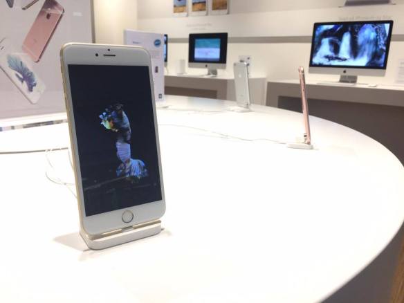
No matter where in the world I am, when I go to an “iStore”, I know exactly where things are, the placement of products, use of furniture and even the simple blue shirts of my specialists are all synchronised to give the customer the same Apple experience.

Wherever geographically you might be located you know that you are at Apple.

12632954_10153728568380901_1810618263_o (1)

Evaluate the visual display of the products according to the brand ideal. (For example, if the brand ideal is “value”, is this expressed in the way they display the products?)

The display is well orchestrated in unity with the other resellers, minimalistic furnitures, the use of light and even uniforms, breaths simplicity and yet gives a sensation of quality and style.


Loose Da Juice

12596945_10153721421050901_786089994_o

Learning activity

You are briefed to do an illustration for a fruit juice packaging (orange and banana flavour). The name of the product is: Loose Juice.

  • Draw at least 15 scamps (they can be A6 size each) of what the label will look like. Remember to include the fruit, the name of the flavour and the name of the product.
  • Choose one of your sketches and draw the label, using Adobe Illustrator. The artwork can be A6 (landscape or portrait).

This was the learning activity/assignment I was not really looking forward to, I suck at drawing. So after 14 sketches, I went for my first drawing; Orange and Banana on the run.

loose juice .png

The Spoon

Featured


12499378_10153330016656824_1456724458_o

Spoon

The tea spoon I was given to this assignment was an ordinary metal tea spoon, by applying the SCAMPER I substitute the materials for renewable primary products, 100% compostable and environmentally friendly, modifying the spoon by rearranging its anatomy, eliminating the stem and making a steady handle from tip to drop

This is an aesthetic and eco-friendly alternative to the ordinary single-serving plastic crockery.

The spoon will display a natural design, which will be perfect for food presentations, events, catering and barbecues.


These wooden spoons are tasteless and food-safe, allowing us to put them to use and combining them with other products


We are focusing our marketing strategy in combining with a high quality rice packaged on recycled kraft paper, the innovating design of the bag of Rice will be adaptable to bring the complementary wooden spoon as a perfect duo


Moodle map

GRA1_ GRA102_Assignment00_ Work_Methods_Daniel_Lisigurski_110116


The task

Draw a map, using a pencil and paper, of the different areas and elements within Moodle.

Scan the map, and store it as a JPEG format. 

Make an effort with this assingment, and dare to be creative. This is your first chance to think outside the box – or deconstruct the box completely.

Rice package

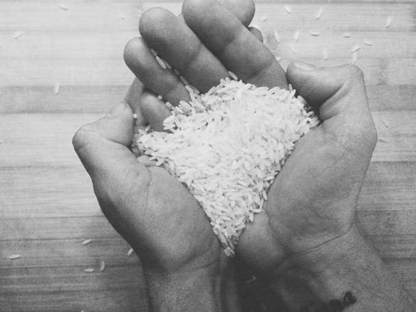
ricehands

The task.

To design packaging for rice. The packaging has to be different from what is out there in the market. Apply each one of the SCAMPER techniques and do a write-up on your findings. Then choose the option that you think would work best and do a sketch of what the packaging would look like.


rice package D.jpg

“Raiz” as I will call my product is a green, eco-friendly packaging alternative.

Environmentally sound packaging options are becoming a major focus for consumers and retailers alike. The growing appeal of eco-friendly alternatives is compelling packaging manufacturers to provide innovative solutions for the expanding market.

These brown bags are designed for easy-opening, mess-free pouring, and to stand up and out. Using recycled kraft  rice paper for our packaging we will continue on our attempt to lessen our packaging footprint on the environment. This design will provide brand recognition and give an edge to stand out in that store’s aisle.

Substitute something.

The common  plastic packaging for a more friendly and better looking material.

Combine it with something else.

A complementary wooden spoon, aline with the eco-friendly spirit of the bag, full recyclable and 100% organic.

Adapt something to it.

This trendy bags will display no unnecessary prints, on the front of the package a small fabric tag will be attached, written on it, the type of rice. The tag will also serve as a holder for the promotional spoon our sister company has designed.

The package will be home for 9 type of rice and the transparent window will give us a glance of taste.

Screen Shot 2016-01-13 at 12.32.32 AM.png


Modify or Magnify it.

A bioplastic ziplock mechanism keeps the rice fresh and air tight.

Put it to some other use.

With a  ziplock  mechanism and transparent  window the bag becomes a perfect recipient for storage of any sorts.

Eliminate something.

Keeping with our green profile we will  eliminate  the use of conventional ink, vegetable ink will be use for the essential info and taking away any unnecessary information on the package.

Reverse or Rearrange it.

Instead of being a conventional package we come up with  a stand up pouch design, which allows the bag to stand up.


Mc Donald’s and the Scamper

From selling Hot dogs on Route 66, ten cent hamburgers and all-you-can-drink orange juice, Mc Donald’s has evolved to have 36000 locations in more in than 115 countries serving an average of 69 million costumers a day making about 27 billion bucks a year

While McDonald’s was not the first franchise business, it has possibly become the premier example of the business model.

mac D first location

As a learning activity for this week at Noroff’s we been asked to research and explain which parts of the SCAMPER model are evident in its development onto its current success.

for those who are not geeky enough SCAMPER for dummies as follows

Alex Osborn, teacher of creativity, first identified the nine principle ways of manipulating a subject. Bob Eberle in the early 70s arranged them into the SCAMPER method

SCAMPER is based on the notion that everything new is a modification of something that already exists. Each letter in the acronym represents a different way you can play with the characteristics of what is challenging you to trigger new ideas:

  • Substitute something
  • Combine it with something else.
  • Adapt something to it.
  • Modify or Magnify it.
  • Put it to some other use.
  • Eliminate something.
  • Reverse or Rearrange it.

Mc Donald’s has combined the vision and innovating spirit of Kroc and a small existing hamburger joint, adapting their restaurants to be able to have indoor seatings in 1972, modifying their menu to serve breakfast in 1985. They have eliminated  a predominant barbecue menu to specialize on hamburgers, then rearranging it to nine items in 1948. The burger Giant has put it self to other use with the implementation of McCafé and Hamburger University, they have substitute a flat face cheff mascot for a disturbing clown who has it’s own charities; Ronald McDonald House Charities

mcdonalds-speedee

We could try to breakdown Mc D with the scramper, But I think it will overlap on so many categories so I just leave some info worth knowing

“Ray Kroc a Multi-mixer salesman, met Dick and Mac McDonald while visiting  their restaurant in San Bernardino, California In 1954, to whom he pitched his vision of creating McDonald’s restaurants all over the U.S.  In 1955 he founded the McDonald’s Corporation, and 5 years later bought the exclusive rights to the McDonald’s name. By 1958, McDonald’s had sold its 100 millionth hamburger.”

In 1949 they started to add items to their menu, modifying it, with the Triple Thick Milkshake. The brought In 1968 the Big mac and the Hot Apple Pie , in the 70’s the Quarter Pounder and the Happy Meals made it up to the menu, in the 80’s Chicken McNuggets and Fresh Salads were kicking in, the 90th were all about the chicken, Chicken McGrill and Crispy Chicken where in the house (1997) , in the 00’s   Fruit ‘n Yogurt, Snack Wraps, and their Premium Salads are representing for the healty ones

In 1961, Kroc launched a training program, later called Hamburger University,  Today, more than 80,000 people have graduated from the program.the graduates receive Bachelor of Hamburgerology degrees

like for real I don’t know what I’m doing studing Graphic designe when I could be a Hamburgerologyst

In 1965  on   10th anniversary McDonald’s goes public  bringing the company to a whole another context, the stock market. making the Mc Donald’s one of the 30 companies to be part of the Dow Jones

Speedee with his flat face was replaced by Ronald McDonald in 1967 who mades it to the Macy’s Thanksgiving Parade. becoming a publicity boom for the company.

Adapting a drive-thru option  in their restaurant near Fort Huachua in 1975, the soldiers who were forbidden to get out of their cars in army fatigues could be served

For the earlybirds  McDonald’s on 1975  brought the Egg Muffin.

The first Ronald McDonald House opens in 1974. a place to combining  brand loyalty and social responsibility.

Another modification was the opening of McDonald’s first restaurant with indoor seating in Colorado, in 1962, McCafe  in 2009 and in  2010,  free WI-FI offered to every visitor.

McDonald’s published its first Global Social responsibility Report in 2002; when they opened the world’s first HFC (hydroflurocarbon)- free restaurant in Denmark in 2003;

I personally don’t like Mc Donald’s, like if I gonna go for junk then I go for the King, But is been quite interesting to apply the Scramper method to Mc Donald’s and learn the importance of adapting  and modifying


Classlist

Full time
Amalie Lisell Lendl Berge
Anna-Katharina Hole
Asie Mohammedi
Charlotte Wiik
Christina Gjertsen
Daniel Lisigurski
Egill Hjaltalin
Elisabeth Carlsen
Felicia Francis
Karianne Haraldseide
Kristin Ådnanes
Magnus Grønberg

Part time
Carina Skajaa
Heidi Davidson
Nina Christine Hegland 

Work Schedule & Mandatory assignments

Semester 1

Academic week 01 – Introduction Week
Introduction to Graphic design, and WordPress
05.01 – 10.01.2016
Mandatory Assignment 00: Delivery Monday 11.01 at 10:00 A.M.

Academic week 02 – Idea Development
Creativity, methods and techniques
11.01 – 17.01.2016
Mandatory Assignment 01: Submission as a part of portfolio 1 in study week 16

Academic week 03 – Sketching Techniques
Outline of techniques
18.01 – 24.01.2016
Mandatory Assignment 02: Logo, Submit at end of week 05 at 4pm

Academic Week 04 – Brand Identity
Logo, Identity and Strategy
25.01 – 31.01.2016

Academic Week 05 – Typography
Fundamentals of typography
01.02 – 07.02.16
Mandatory Assignment 02 delivery 05.02 at 04:00 P.M.

Academic Week 06 – Colour Theory
Fundamentals of Colour
08.02 – 14.02.2016

Academic Week 07 – Photography 1
History of Photography: An Introduction
15.02 – 21.02.2016
Mandatory Assignment 03: Illustration, Submit at end of week 08 at 4pm

Academic Week 08 – Photography 1
Know your camera, Camera functions
22.02 – 28.02.2016
Mandatory Assignment 03: Delivery 26.02 at 04:00 P.M.

Repeat Week
Get Inspired and repeat lessons
29.02 – 06.02.2016

Academic Week 09 – Layout
Fundamentals: Layout and Composition
07.03 – 13.03.2016
GRAP Submit at week 15, Friday  at latest 4 pm
Mandatory 04: Layout, Submit at week 11 at 4 pm
Utlevering, GRAM submit at week 16 at 4 pm

Academic Week 10 – Layout
Fundamentals: Layout and Composition
14.03 – 20.03.2016
Project Description/Schedule delivery 18.03 at 04:00 P.M.

Academic Week 11 – Print Preparation
Final print stage
28.03 -03.04.2016
Mandatory Assignment 04 delivery 01.04 at 04:00 P.M.

Academic Week 12 – Project Exam
04.04 – 01.05.2016

Academic Week 13 – Project Exam
04.04 – 01.05.2016

Academic Week 14 – Project Exam
04.04 – 01.05.2016

Academic Week 15 – Project Exam
04.04 – 01.05.2016
Project Exam delivery 29.04 at 04:00 P.M.

Academic Week 16 – Portfolio 1st semester
02.05 – 08.05.2016
Portfolio delivery 06.05 at 04:00 P.M.


Semester 2

Academic Week 17 – Introduction to Web Design
Key terms, Internet, HTML, search engines and web browsers
09.05 – 15.05.2016
Mandatory Assignment 05,1 -2: Product Website
Submit 05, 1 at week 23, Friday at 4pm
Submit 05,2 at week 31 at Friday at 4pm

Academic Week 18 – Web Design Process 1
Planning
16.05 – 22.05.2016

Academic Week 19 – Web Design Process 2
Designing for Web, (Part 1)
23.05 -29.05.2016

Academic Week 20 – Web Design Process 3
Designing for Web, (Part 2)
30.05 – 05.06.2016

Academic Week 21 – Photography 2
Photo essay: Portraits, studio Photography, lighting, camera techniques..
06.06 – 12.06.2016
Mandatory Assignment 06: Photography 2, Submit at week 22, Friday at 4pm

Academic Week 22 – Photography 2
Photo essay: Portraits, studio Photography, lighting, camera techniques..
15.08 – 21.08.2016
Mandatory Assignment 06: Delivery 19.08 at 04:00 P.M.

Academic Week 23 – Web Design Process 3
Development (part 1)
22.08 – 11.09.2016
Mandatory Assignment 05 part 1: Delivery 26.08 at 04:00 P.M.

Academic Week 24 – Web Design Process 3
Development (part 2)
22.08 – 11.09.2016

Academic Week 25 – Web Design Process 3
Development (part 3)
22.08 – 11.09.2016

Academic Week 26 – Graphic Design 2
Creative Workflow
12.09 – 02.10.2016

Academic Week 27 – Graphic Design 2
Visual Language
12.09 – 02.10.2016

Academic Week 28 – Graphic Design 2
Packaging Design
12.09 – 02.10.2016
Portfolio 2: Submit at week 33, Friday at 4pm
Project Exam 2: 
Submit Project Examat week 38, Friday at 4pm              Submit Web project Description/Schedule at week 31

Repeat Week
Get Inspired and repeat lessons
03.10 – 09.10.2016

Academic Week 29 – Graphic Design 2
Point to Sale
10.10 – 16.10.2016
Mandatory Assignment 07 delivery 14.10 at 04:00 P.M.

Academic Week 30 – CMS and WordPress
Part 1
17.10 – 06.11.2016

Academic Week 31 – CMS and WordPress
Part 2
17.10 – 06.11.2016
WEB Project Description: Delivery at 04:00 P.M.
Mandatory Assignment 05, part 2: Delivery at 04:00 P.M.

Academic Week 32 – CMS and WordPress
Part 3
17.10 – 06.11.2016

Academic Week 33 – Portfolio 2
07.11 – 13.11.2016
Portfolio delivery 11.11 at 04:00 P.M

Academic Week 34 – Project Exam 2
14.11 – 18.12.2016

Academic Week 35 – Project Exam 2
14.11 – 18.12.2016

Academic Week 36 – Project Exam 2
14.11 – 18.12.2016

Academic Week 37 – Project Exam 2
14.11 – 18.12.2016

Academic Week 38 – Project Exam 2
14.11 – 18.12.2016
Project Exam delivery 16.12 at 04:00 P.M.

Last day of School 16.12.2016