Learning activity – Symmetry/Asymmetry

On an A4 landscape page, draw four equal squares. Create 4 more pages in this way. So, you’ll have 5 pages with four squares on each.

Draw one or two squares or rectangles in each empty square to achieve the following visual effects (refer to your textbook, p.41 as guidance). You can work with the interaction of rectangles and squares to make the balance or imbalance more evident.

  • Entering left

  • Movement to the right

  • Movement to the left

  • Movement downwards

  • Movement upwards

  • Balance

  • Tension

  • Symmetry/asymmetry

Produce at least two different versions of each effect, recording your results each time. Explain in one or two sentences what you wanted to achieve (as shown in your manual).


Entering left

1. / 2. With the square/rectangle on the left side it appears to enter from the left.

Balance

3. / 4. By centering it becomes a clean and balanced shape as one or two.

12421984_10153846188520901_563033364_o

Movement left / right

5. / 6. / 7. / 8. Two shapes is sided left / right for it to appear that they are moving that direction.

12874340_10153846190555901_2082055565_o

Movement downwards / upwards

9. / 10. / 11. / 12. Same principle as in the last four, only the movement is downwards / upwards.

12422149_10153846192395901_983406173_o

Tension

13. The tension in tipping on a ledge, almost falling off.

14. The tension of the massive weight on a small square.

Symmetry/Asymmetry

15. Two squares to be able to be fold over each other – symmetric.

16. Two rectangles asymmetric of each other.

12380923_10153846192640901_116278625_o

Symmetry/Asymmetry

17. Two shapes that are asymmetric of each other.

Balance

18. The balance of one rectangle on a quadrat on it’s tipp.

Symmetry/Asymmetry

19. An asymmetric quadrat and a rectangle in big difference of size.

Balance

20. The placement of two like sized quadrat on the oposite cornoer you get a balance of elements inside the square.

12675061_10153846192890901_1313713114_o

Learning Activity – Exposure Basics


After reading the appropriate section in your prescribed textbook From Snapshots to Great Shots, please answer the following questions:

Name all the functions / buttons on the front of your camera

Screen Shot 2016-02-26 at 09.49.30


Name all the functions / buttons on the back of your camera

Screen Shot 2016-02-26 at 09.50.00


Explain how you would set the correct ISO

Press the < >(ISO speed setting/Flash exposure compensation) button. While looking at the LCD panel or viewfinder, turn the <Main dial>.ISO speed can be set within ISO 100 – 25600 in 1/3-stop increments.

With “A” selected, the ISO speed will be set automatically.

If the ISO speed is set to “A” (Auto), the actual ISO speed to be set will be displayed when you press the shutter button halfway. As indicated below, the ISO speed will be set automatically to suit the shooting mode.

Explain how you would change the aperture

To change the aperture I will  use the quick control dial on the back of the camera.

Explain how you would change the shutter speed

I will change the shutter speed by scrolling the main dial wheel on top of the camera.

Take five pictures every day for the next five days. The subjects of your pictures can include a series of different objects, people and landscapes. Apply the manual settings as explained in your textbook. Submit your six best pictures at the end of the week, listing the following with each picture:

ISO, Aperture, Shutter speed

This week found me between Russia, Norway en Peru, take a look

babushka.JPGISO 100, Aperture 5.6, Shutter speed 1/160


D.JPGIso 100, Aperture 4.0, Shutter speed 1/125


building out of focus.JPGIso 400, Aperture 28, Shutter speed 1/800


monkey boyISO 100, Aperture 4.0, Shutter speed 1/125


Kiana B day.JPGIso 200, Aperture 2.8, Shutter speed 1/50


carISO 100, Aperture 3.5, Shutter speed 1/640

Mandatory Assignment 03 – Illustration


A musician / group / orchestra have contacted you and want a visual representation of one of their songs. You are free to choose the music.

You are to produce a photo based illustration with vector elements (Illustrator) based on one of their songs. The client wishes the illustration to add a new dimension to the music.

There is no opportunity to use text in the poster.

The illustration must be in the format 210 x 300 mm, with a resolution of 300ppi and 3 mm bleed.

Africa Unite

Bob Marley


map Africa texture.png

GRA1_Assignment_03_Illustration_Daniel Lisigurski_260216

Learning Activity – History of Photography 2

Go to the library or search on the Internet and find a photograph from the 19th century (taken before 1900). Write a short “think piece” about this photograph. You are free to select any image you would like to write about, as long as the photograph was taken during the 19th century. Examine the photograph carefully and write about what you see and what the photograph makes you think about. Some (but not all) things you could consider are:

  • What does the photograph tell you about the photographer?
  • What does it tell you about the subject of the image?
  • Does the technical quality of the image (or lack thereof) help or hinder the success of the photograph?
  • Where did the photographer stand when he or she took this picture?
  • How does his or her camera position or angle affect the outcome of the image?
  • Why does this picture interest you?

In short, tell me what you think about the image in your own words. This assignment is to be written in a word processor (doc, docx or pdf) and uploaded to your WordPress blog. The image you are writing about should be included as an embedded image in your paper.

19th century Photograph

Learning Activity – History of Photography

Pick three events in the timeline from this week’s lesson History of Photography: An Introduction, and find photographs of the event on the Internet or in the library and write a paragraph explaining the event in more detail. Include your photographs in the description.

Sun Prints

Even though the first pinhole camera (also known as the camera obscura) was invented in about 1 000 AD by a man called Alhazen, and revisited by Aristotle at around 330 BC. It was not until a summer’s day in 1827 when Joseph Nicephore Niepce took the first photographic image with a camera obscura

first pic

Before Niepce took this photograph, artists only used the camera obscura to help them draw pictures, never to take photographs. Niepce’s creations were aptly named “sun prints”, since light is used to draw the picture. These prints formed the blueprint for modern photography.

Niepce created his sun prints by engraving a picture onto a metal plate, coating it in bitumen and then exposing it to light.

The daguerreotype

DAGapparatus.jpg

Another Frenchman, Louis Daguerre was also looking for ways to capture images with light. It took Daguerre over a decade before he was able to reduce the exposure time to less than half an hour and prevent the image from disappearing afterwards. This process made Daguerre the father of the practical process of photography.

In 1829 Daguerre and Niepce joined forces to improve the process of photography. After about ten years of experimentation, Daguerre created an easier and more effective way of taking photographs and called it the daguerreotype.

Daguerre would “fix” an image onto a sheet of silver-plated copper. He would then polish the silver and coat the sheet with iodine, which creates a surface that is sensitive to light. He then placed this plate in a camera and exposed it to light for a few minutes. After the image was created, Daguerre bathed the plate in a solution of silver chloride. This ensured that the image would last and that it wouldn’t change when it got into contact with light.

Daguerre and Niepce’s son sold the rights for daguerreotype to the French government in 1839. They also wrote and published a booklet that describes the process. The daguerreotype quickly became popular and in 1850 over seventy daguerreotype studios could be found in New York City alone.

Wet Plate Negatives

boyd.jpg

A Wet-Plate Glass Negative of Confederate Spy Belle Boyd, Isabella Marie “Belle” Boyd (1844 – 1900) was one of the most famous and notorious Confederate spies

In 1851, Frederick Scoff Archer, an English sculptor, invented the wet plate negative. Using a viscous solution of collodion, he coated glass with light-sensitive silver salts. Because it was glass and not paper, this wet plate created a more stable and detailed negative.

Photography advanced considerably when sensitised materials could be coated on plate glass. However, wet plates had to be developed quickly before the emulsion dried. In the field this meant carrying along a portable darkroom.


Learning Activity – Colour Theory


1.1 Having watched the video with Nigel French – describe, in your own words, what each of these colour systems means: RGB and CMYK.

cmyk-rgb

CMYK

Stands for the initials of  cyan, magenta, yellow and black.(the word on the street is the K is for key and not for black) anyways

It is subtractive, like paint. you start with nothing (white) and as you add more colours it eventually turns black.

CMYK is the mode use for print media and represents the standard coloured inks that printers use.

RGB

Comes from the initials of the three primary colours, red, green, and blue.

The RGB colour model is an additive, in which red, green, and blue light are added together in different ways to reproduce  colours.

RGB is intended for the display of images in electronic systems.

1.2. Make use of Kuler and develop four different colour schemes. You must hand in screen shots of your schemes as done with Kuler:

Monochromatic

Screen Shot 2016-02-12 at 19.28.49

Triadic

Screen Shot 2016-02-12 at 19.31.04

Analogous

Screen Shot 2016-02-12 at 19.32.26

Complementary

Screen Shot 2016-02-12 at 19.40.00.png


2. Use a colour photo of your choice and create the following colour effects 


Daria crop.png

I choose a pic of my girl D, alway so hot and mysterious


a. Create an “Andy Warhol” look


Daria Warhol.png


b. Apply a sepia look


c. Split toning of the image


  1. Freestyle: a colour effect of your choice


Daria Tint

I’m running late so I just add a tint

3. Design a book cover for one of the following:
a.) “To the Lighthouse” by Virginia Wolf: use complementary colours to express anguish and uncertainty.
b.) “The Maiden’s Tale” by Margaret Atwood: use analogous colours with a contrasting accent to express disagreement and discontent.
c.) “The Little Prince” by Antoine de Saint-Exupery: use secondary colours to express naivety, honesty and harmony.

  • The book cover must contain the title and the author’s name.
  •  You must clearly make use of colour to express the desired effects.


This is the color palette I use to express naivety, honesty and harmony.

Screen Shot 2016-02-14 at 02.57.21


.prince 2.png

Learning Activity – Expressing Meaning

Choose two words from the list below:

  • Compression
  • Transition
  • Contraction
  • Addition
  • Subtraction
  • Disruption
  • Repetition
  • Elimination
  • Migration
  • Expansion

Also, create a “new” word, which has no dictionary definition, and a meaning that only you know, Then create three different compositions for your three words, one word per composition.


EXPANSION


Screen Shot 2016-02-05 at 7.09.20 PM


repetition


I keep it pretty simple by expanding the expansion word and disrupting the disruption word and I finished by Chillaxing the Chilax.

The creative process and memorable mentions:


Screen Shot 2016-02-07 at 11.08.12 PM


Mandatory 02 Logo


A new chocolate brand is trying to enter the market and you are asked to design a logo to represent the brand. (Example of brand; Freia, Anthon Berg, Cadbury, Lindt)

The requirements for the logo are


Use the brand name “Crave”

It should be simple and easily recognizable.

Timeless, and preferably not more than 2-3 colors.

It Should contain a symbol / figure / ornament, and a title (name / brand)

Check it out here GRA1_ Assignment_Logo02 _Daniel-Lisigurski_050216

Learning Activity -Understanding positioning

Look at the following logos and explain in your own words what you consider their positioning to be


Coca Cola                                                                                                                                    

Or coke as we call it is the boss of sodas.Like if I’m gonna drink soda is a given a coke would be the choice. Sometimes I might fancy some funky flavours and feeling adventurous spending a night with a fanta, or keeping it light with a sprite, but I always will go back to the boss.

Coke keeps it real and stay true to its promises to refresh the world. 

Coke is an instant synonym of freshness and is drunk every-freaking-where, so yeah refreshing the world, keeping it personal and close to people with campaigns like; “Share a coke” and those annoying cans and bottles with peoples names on. I hated that one; I never found a Daniel-one so I ended up drinking soda with the name of Ole or Atle. Coke is everywhere and wherever they are they are the top dog. Sports, music, multimillion TV ads. Whatever Coke does, they do good. That might be the reason why nobody is ordering rum&pepsi.

Das Auto                                                                                                            

Volkswagen, meaning “People’s car” in German, is among the biggest if not the biggest car manufacturer in tze world. The word on the street is that it started in the 1930s, at the request of Hitler to produce a car designed by Ferdinand Porsche. Da Führer was looking for someone who could make a cheap car that the common German worker could afford.

Volkswagen to me inspires german precision for an affordable price, they have deliver iconic cars like the Beetle and Golf (had them both). The Golf, Beetle and Passat are on some kind of list where Volkswagen has the most record of records of how many cars have been ever sold and some other really smart stuff i found in wikipedia https://en.wikipedia.org/wiki/Volkswagen

  Visa, Everyone, Everywhere, Ever Very                                                                                 

There are some things money can’t buy. For everything else there’s Mastercard.

When it comes to credit cards that’s been the slogan that always caught my attention, but on my everyday I see visa like the  best way to pay and be paid and I know that with VISA I’m accepted everywhere.

Visa connects consumers, businesses, financial institutions, and governments everywhere, secure and reliable Visa is not a bank and does not issue cards, extend credit or set rates and fees for consumers.

However Visa enable its financial institution customers to offer consumers more choices: pay now with debit, ahead of time with prepaid or later with credit products.”

Visa – It’s Everywhere You Want To Be.

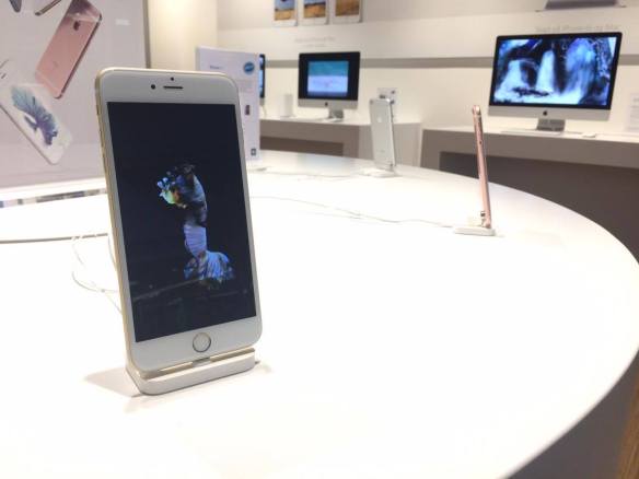
Lets work backwards! Look at the logo on the Apple iPhone and, by doing your own research, investigate the history of the product and the company that manufactures it. Give an outline, in your own words, of what you consider the following to be:

iphone

Describe its brand identity – exactly as you see it

I’m a devoted mac user since the early 2000’s as much for work, school, entertainment or pure pleasure. Apples devices and applications have made my life easier and better looking.

I own several of apple products and it’s nothing sexier than unboxing any given product from apple, carefully nesting on those white boxes. When one start reading “designed by apple in california” you get a chill and you know you are up for an experience – an experience of a product that is the best of its class.

Apple has a branding strategy that focuses on the emotions, lifestyle & simplicity, – bringing the I in to the products, but still makes you feel part of a big tribe.

What do you think its positioning is currently?

Apple has differentiate itself from all competitors, Apple stands for style, cool, innovating, the future, where as Windows stands for world class operating system.

Apple has long applied the rules of fashion to the design and marketing of its devices, desirable not only for their functionality, but for their slick aesthetics and symbolic value, differentiating Apple users from others.

What do you think the strategy for this specific product was?

Apple is reinventing the phone

And they actually did, combining three products—a revolutionary mobile phone, a touchscreen iPod and an internet communicator into one small handheld device.

Letting users control iPhone with just their fingers, with desktop-class email, web browsing, searching and maps. Featuring a 2 megapixel camera that kill the camera star.

“iPhone is a revolutionary and magical product that is literally five years ahead of any other mobile phone. We are all born with the ultimate pointing device—our fingers—and iPhone uses them to create the most revolutionary user interface since the mouse”

Steve Jobs

They used a strategy of secrecy and intrigue to fuel speculation and buzz. Wowing customers through design and packaging with a total focus on “friendly” customer experience.

The result is a passionate brand community of fans who identity themselves with Apple’s brand values.

What research do you think was done on this by the company who made it?

Back in 2003, Jobs expressed that he was not keen on developing his tablet PCs and traditional PDAs as high-demand markets for Apple to enter. He did believe that cell phones were going to become important devices for portable information, and that what mobile phones needed to have was excellent synchronisation software.

To create the iPhone, Steve Jobs deliberately picked engineers with no mobile phone industry experience because he didn’t want Apple’s smartphone to be “tainted” by old ideas about what could and could not be achieved.

Jobs always insisted that market research was pointless because people didn’t actually know what they wanted.

Now take the same product as in question 2 and explain, in your own words, how the visual element (in this case, the logo) fits in with the brand identity.

Apple has always been about simplicity and consistency, as we can see on every product down the line.

The simple outline of an a bitten apple,matches the iPhone’s minimalistic design, the trademark home button, a metal rear casing and the touchscreen display.

For many people Apple’s iPhone is a fashion statement and the apple is a perfect way to brand it.

Learning Activitiy – Understanding Ideals

Visit a popular store, like an Apple, Nike, Levi, H&M or an Ikea store. The brand should be well-known and you must visit a shop where their products are being displayed or distributed. In smaller towns you may not have access to these stores, in this case you will need to find a section showcasing these items and view how they are displayed or laid out.

Before going to the shop, determine the following about their brand identity and, once at the shop, evaluate how they remain true to their brand identity or not. How is the brand identity enhanced (or, perhaps, not expressed) at the point of customer interaction? Hand in a write-up with photos of the following:

IMG_5172

What brand identity element are they using in their logo (e.g. abstract mark or word mark)?

The apple logo is Iconic and is elegantly displayed. The bitten apple invites you to a world of well and carefully designed experience.

12596862_10153728568620901_1963316460_o (1)

What do you think their brand ideal is?

 Apple brand ideal is about lifestyle; imagination; innovation; passion; hopes, dreams and aspirations. Apple is also about simplicity and the removal of complexity from peoples lives. It’s a people-driven product design.

How do they remain true to their brand ideal within their shops?

Super True

Chatting with Jørgen, my Apple Specialist, he told me that to qualify as a Premium Apple Reseller they have certain rules and guidelines to follow.

No matter where in the world I am, when I go to an “iStore”, I know exactly where things are, the placement of products, use of furniture and even the simple blue shirts of my specialists are all synchronised to give the customer the same Apple experience.

Wherever geographically you might be located you know that you are at Apple.

12632954_10153728568380901_1810618263_o (1)

Evaluate the visual display of the products according to the brand ideal. (For example, if the brand ideal is “value”, is this expressed in the way they display the products?)

The display is well orchestrated in unity with the other resellers, minimalistic furnitures, the use of light and even uniforms, breaths simplicity and yet gives a sensation of quality and style.